Show solution
library(ggplot2)

p1 <- ggplot(mtcars, aes(x=wt, y=mpg)) +
         geom_point() +
         ggtitle("Miles per Gallon vs. Weight") +
         xlab("Weight") +
         ylab("Miles per Gallon")
print(p1)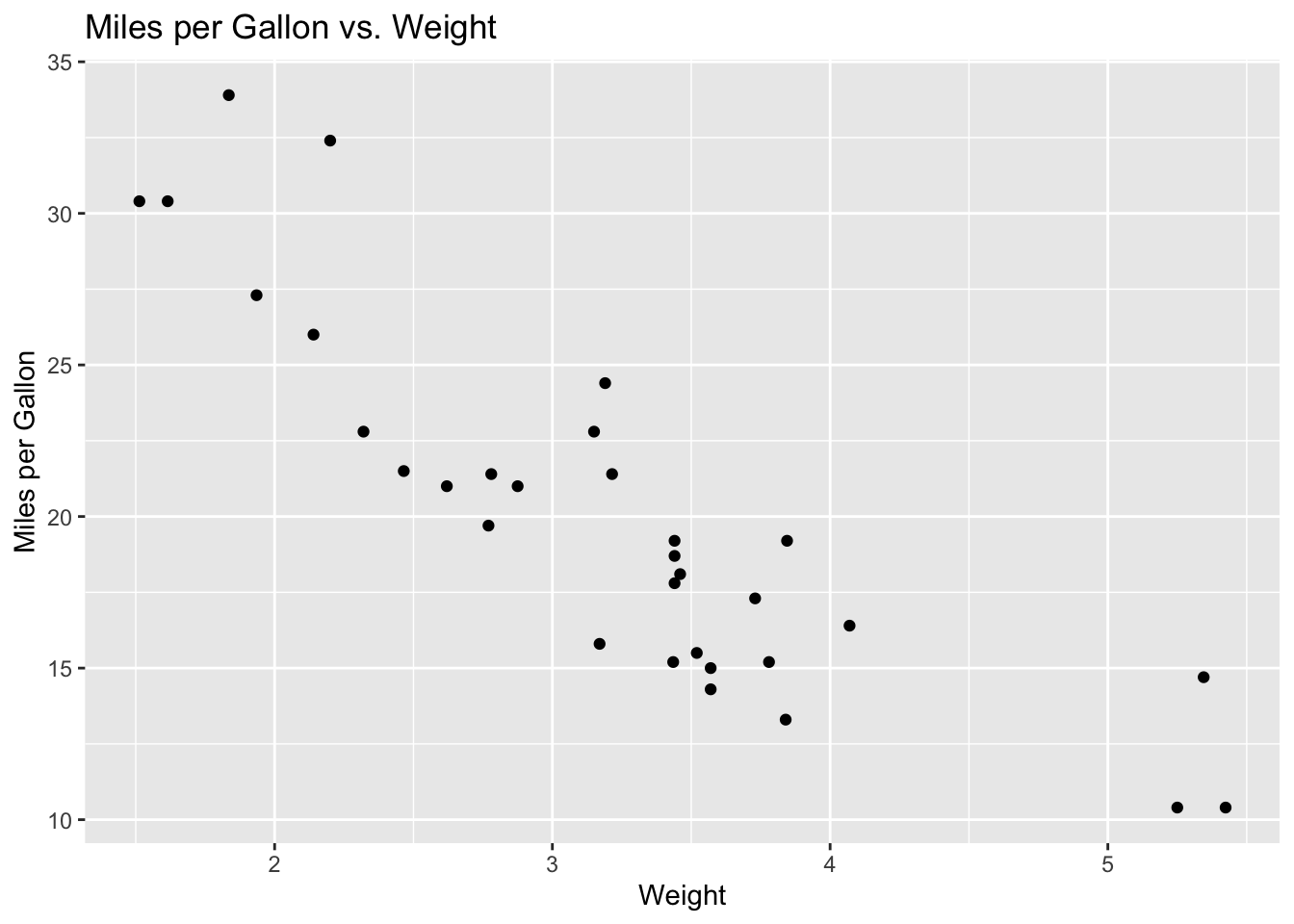
ggplot2The following exercises are designed to encourage you to become familiar with plotting in ggplot2. They all use datasets that are available from within base R, or within the ggplot2 package.
I’ve provided solutions to each of these exercises. Please remember that R is a hugely flexible language and there are often lots of different ways to achieve the same outcome!
ggplot2library(ggplot2)
p1 <- ggplot(mtcars, aes(x=wt, y=mpg)) +
geom_point() +
ggtitle("Miles per Gallon vs. Weight") +
xlab("Weight") +
ylab("Miles per Gallon")
print(p1)
geomsp2 <- ggplot(iris, aes(x=Sepal.Length, y=Sepal.Width, color=Species)) +
geom_point() +
geom_smooth(method='lm', se=FALSE)
print(p2)`geom_smooth()` using formula = 'y ~ x'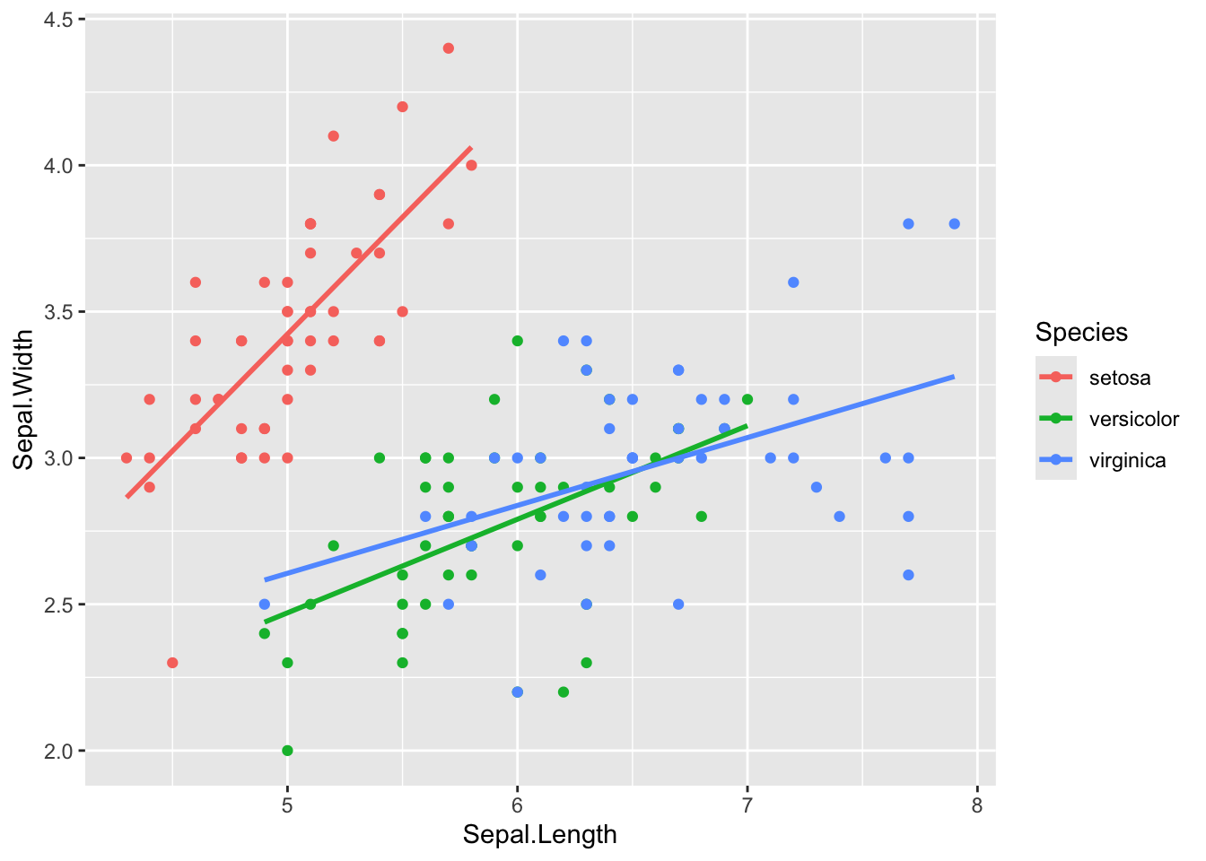
facet_wrap().p3 <- ggplot(diamonds, aes(x=carat, y=price)) +
geom_point() +
facet_wrap(~cut, scales="free_y")
print(p3)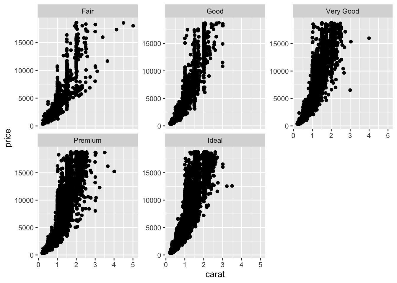
theme_minimal() function to change its appearance.p4 <- ggplot(mtcars, aes(x=wt, y=mpg)) +
geom_point() +
theme_minimal()
print(p4)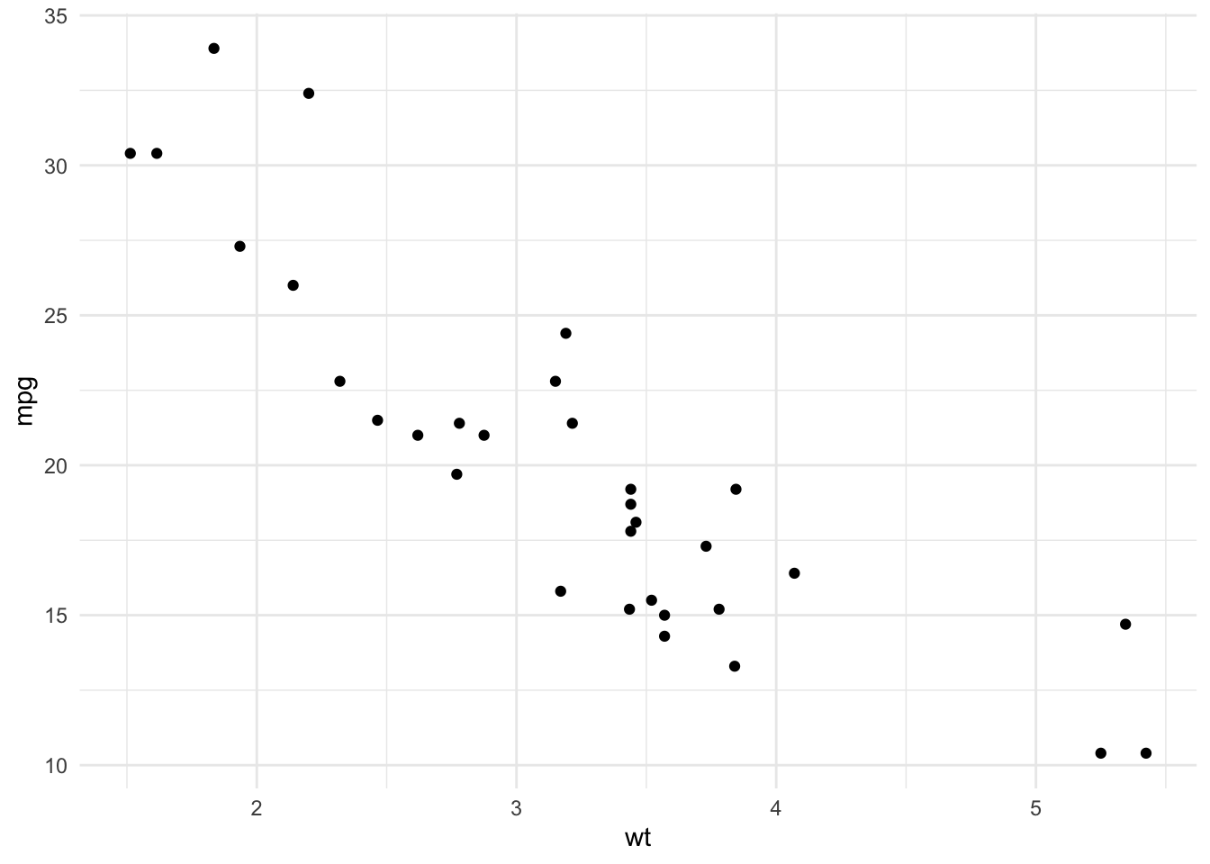
p5 <- ggplot(diamonds, aes(x=cut)) +
         geom_bar() +
         coord_flip()
print(p5)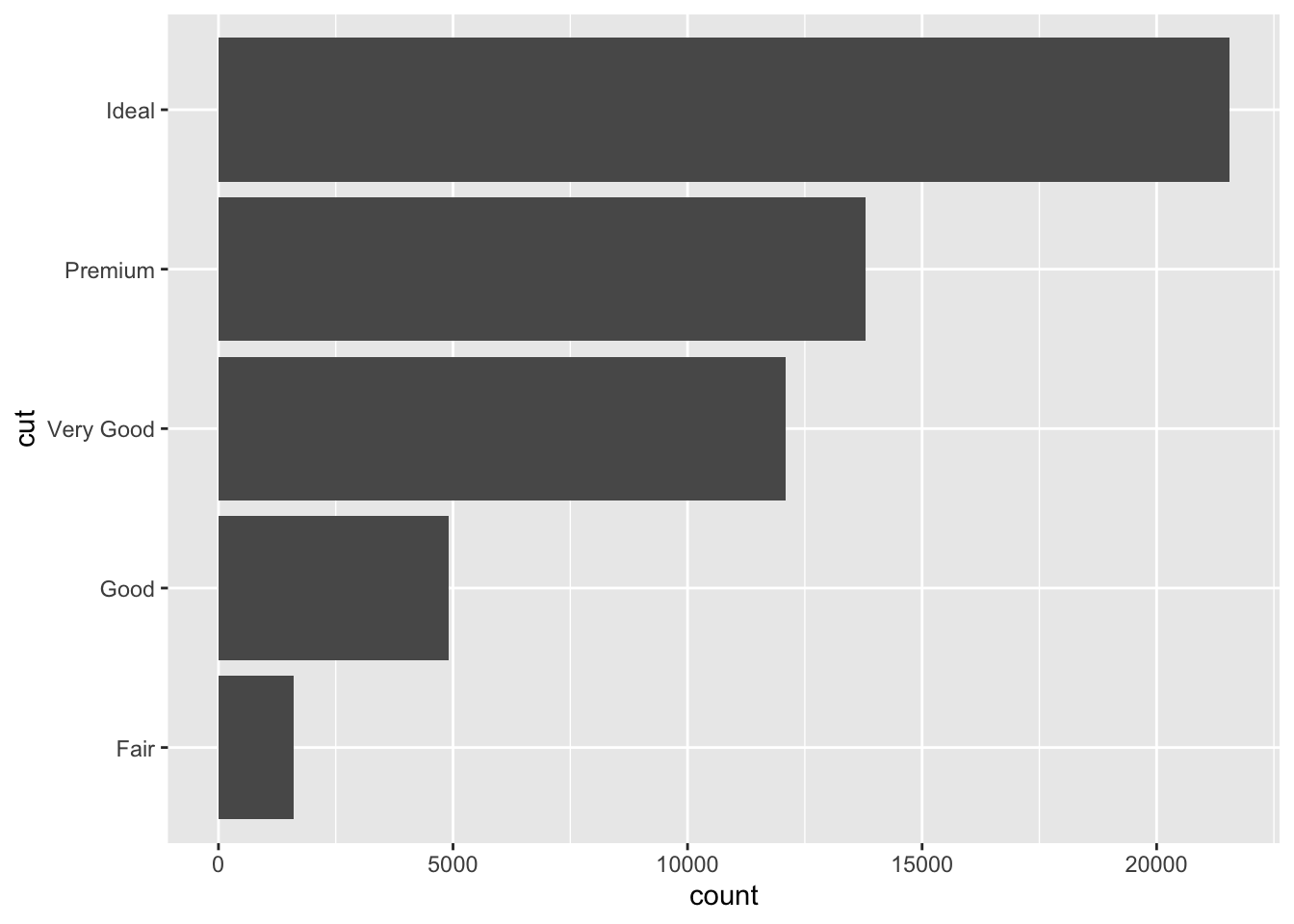
p6 <- ggplot(diamonds, aes(x=price)) +
         geom_histogram(binwidth=500)
print(p6)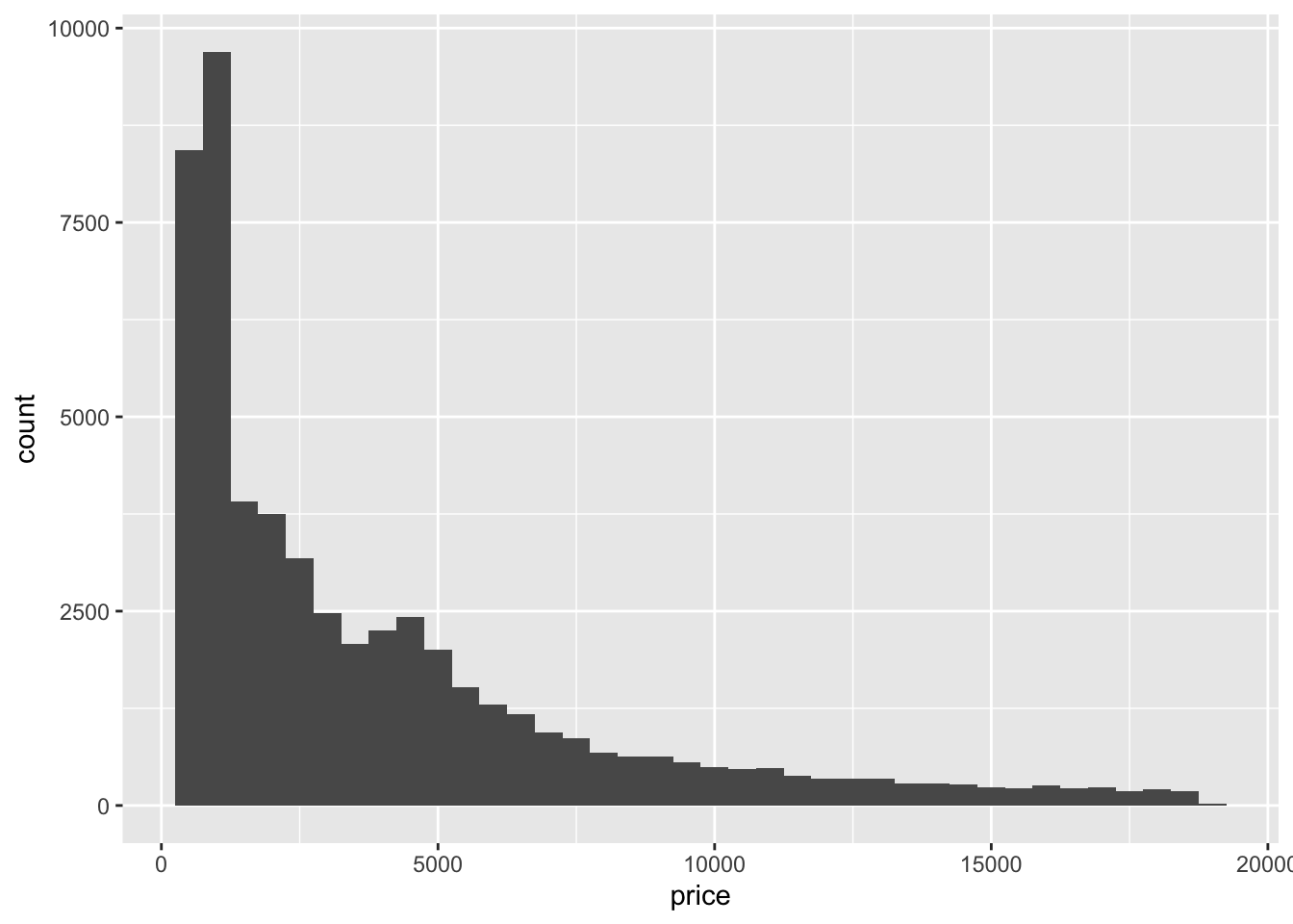
p7 <- ggplot(iris, aes(x=Species, y=Sepal.Length, color=Species)) +
         geom_boxplot(outlier.color="red")
print(p7)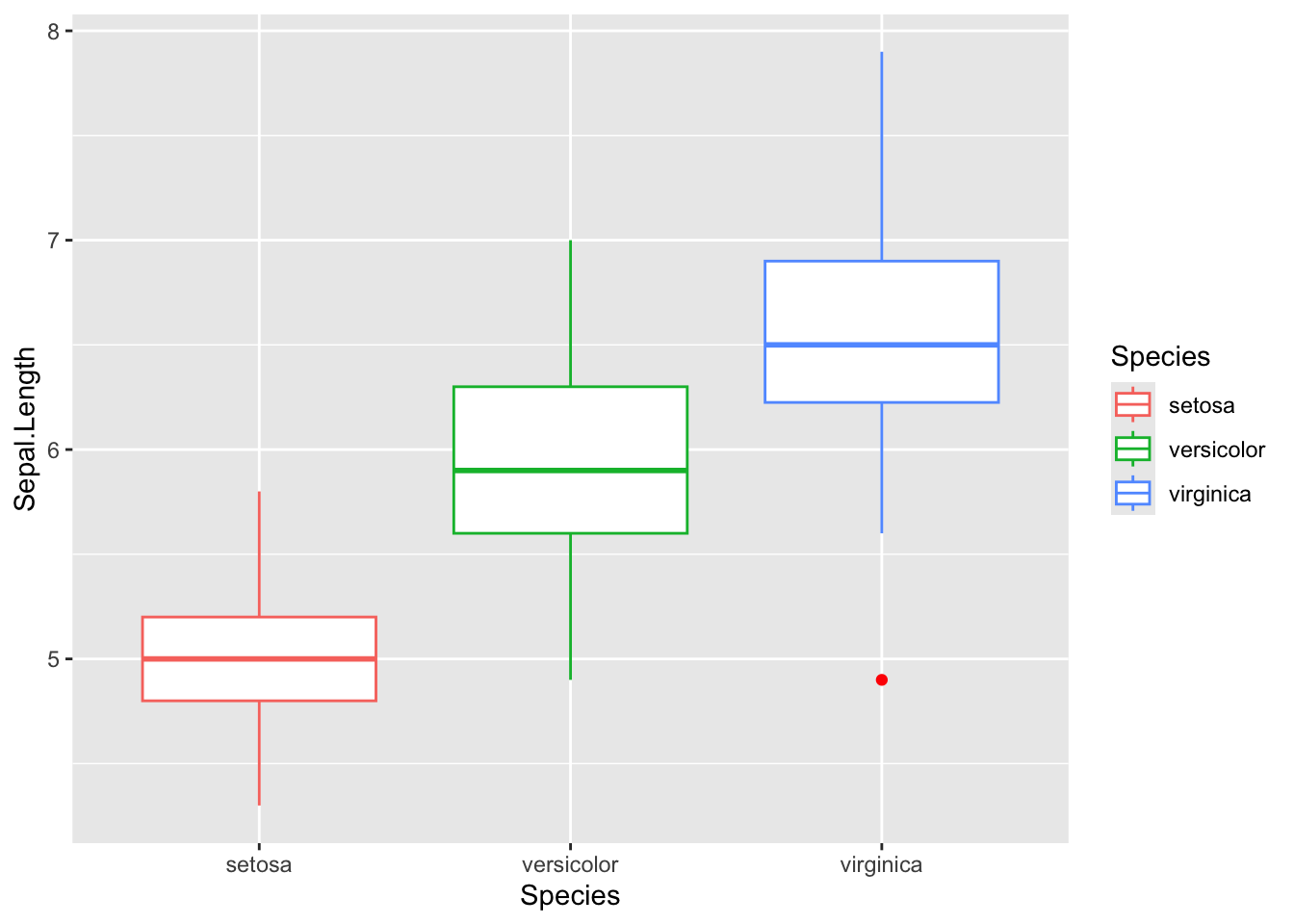
p8 <- ggplot(mpg, aes(x=class, fill=drv)) +
         geom_bar(position="dodge")
print(p8)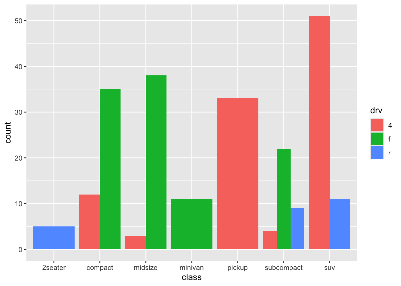
p9 <- ggplot(mpg, aes(x=displ, y=hwy, color=class)) +
         geom_point() +
         labs(color="Car Class") +
         theme(legend.position="bottom")
print(p9)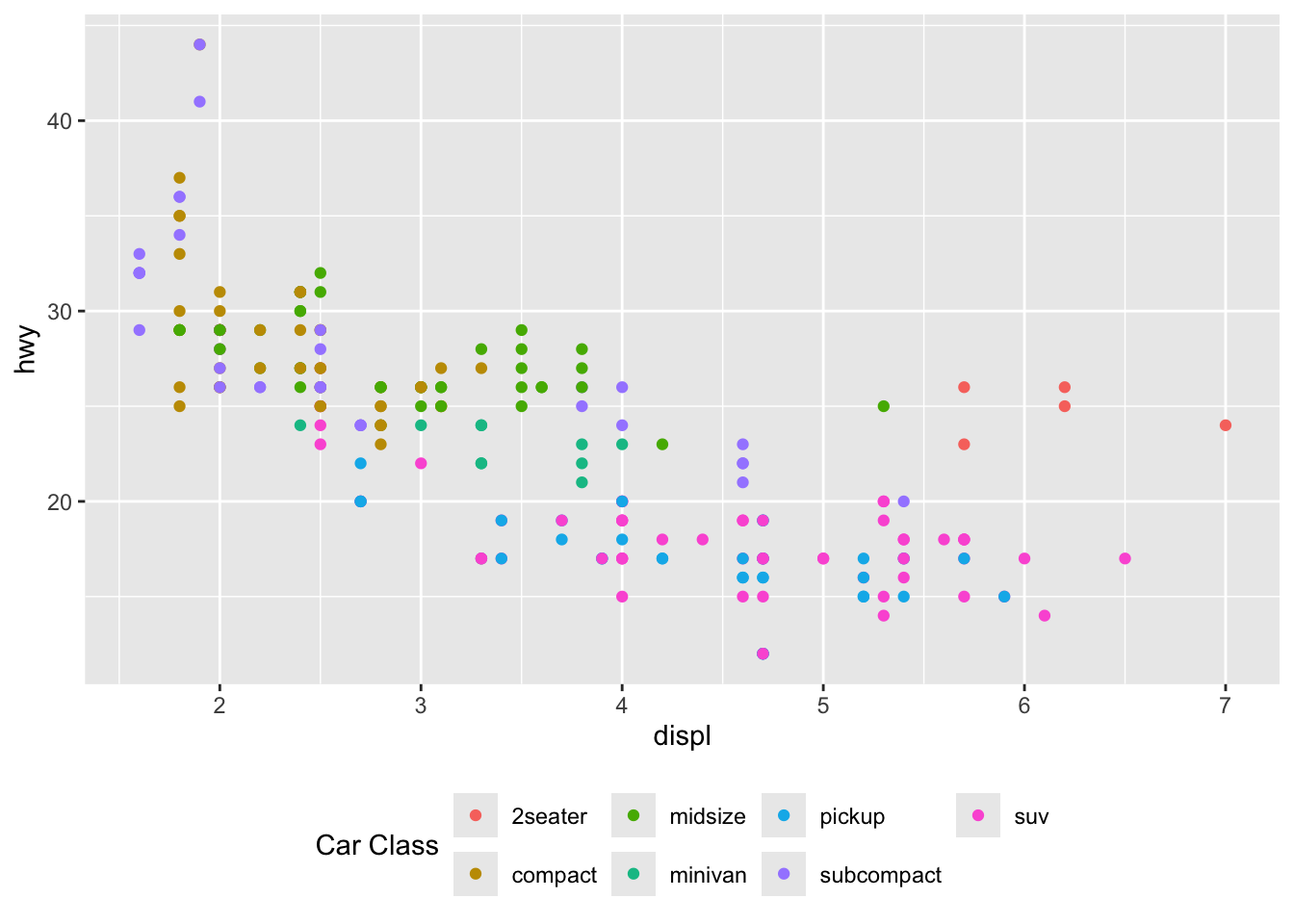
# Save the first plot as a PNG
ggsave(filename="p1_plot.png", plot=p1, width=6, height=4, dpi=300)

# Save the first plot as a PDF
ggsave(filename="p1_plot.pdf", plot=p1, width=6, height=4)